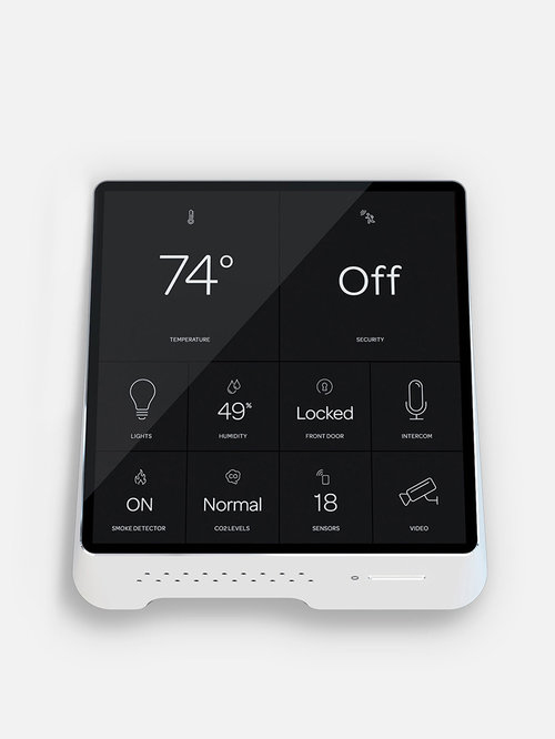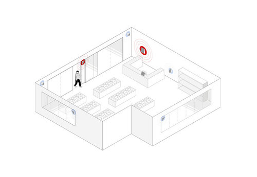
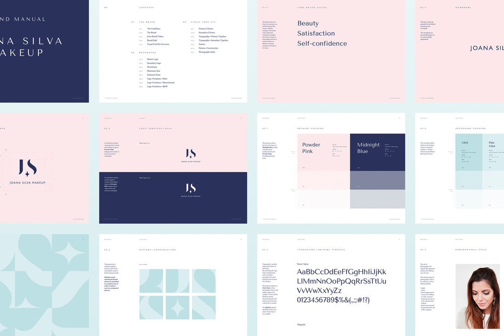
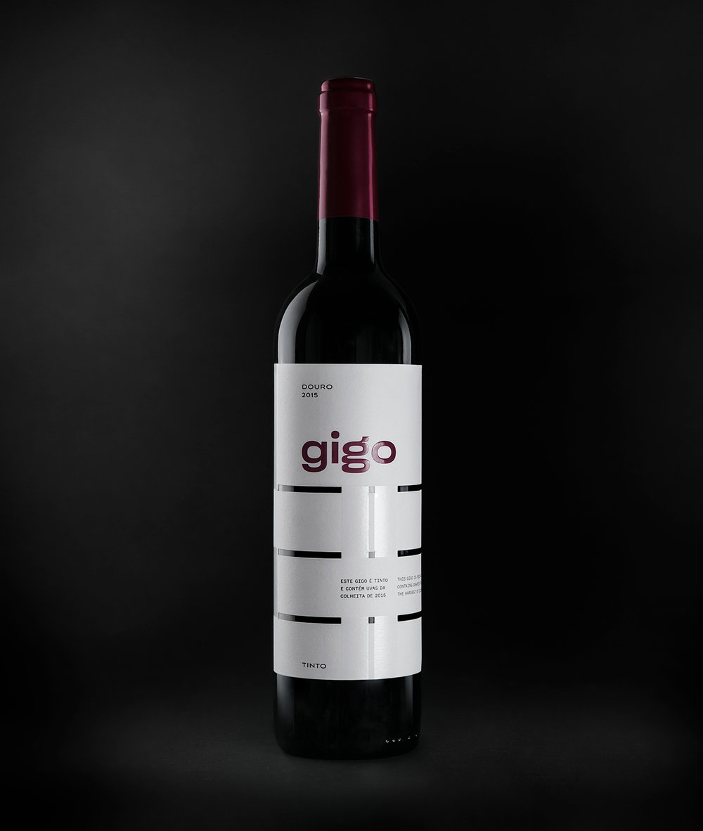
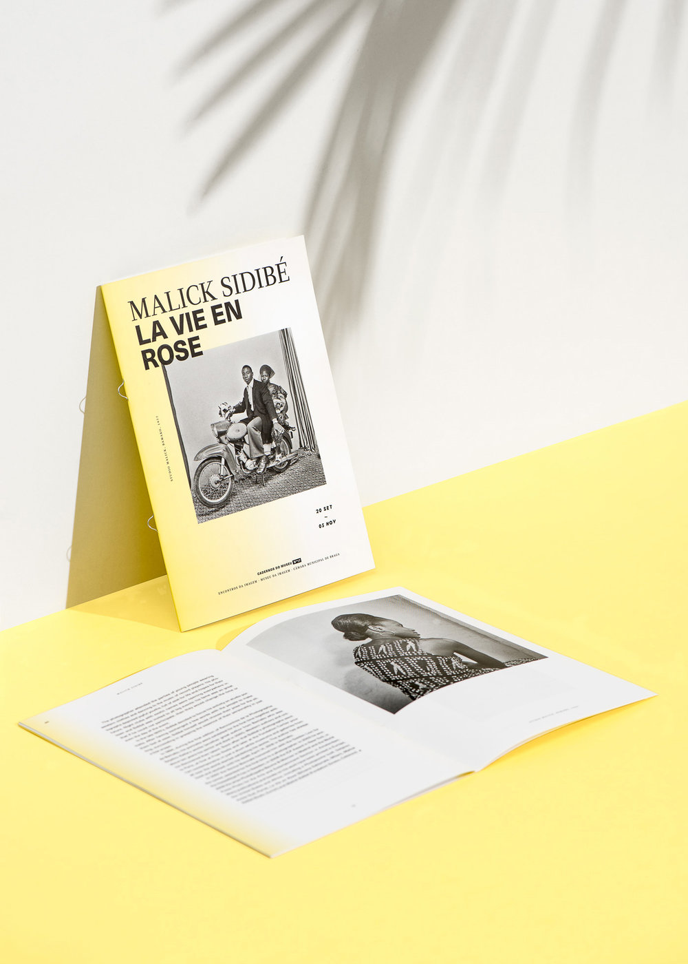
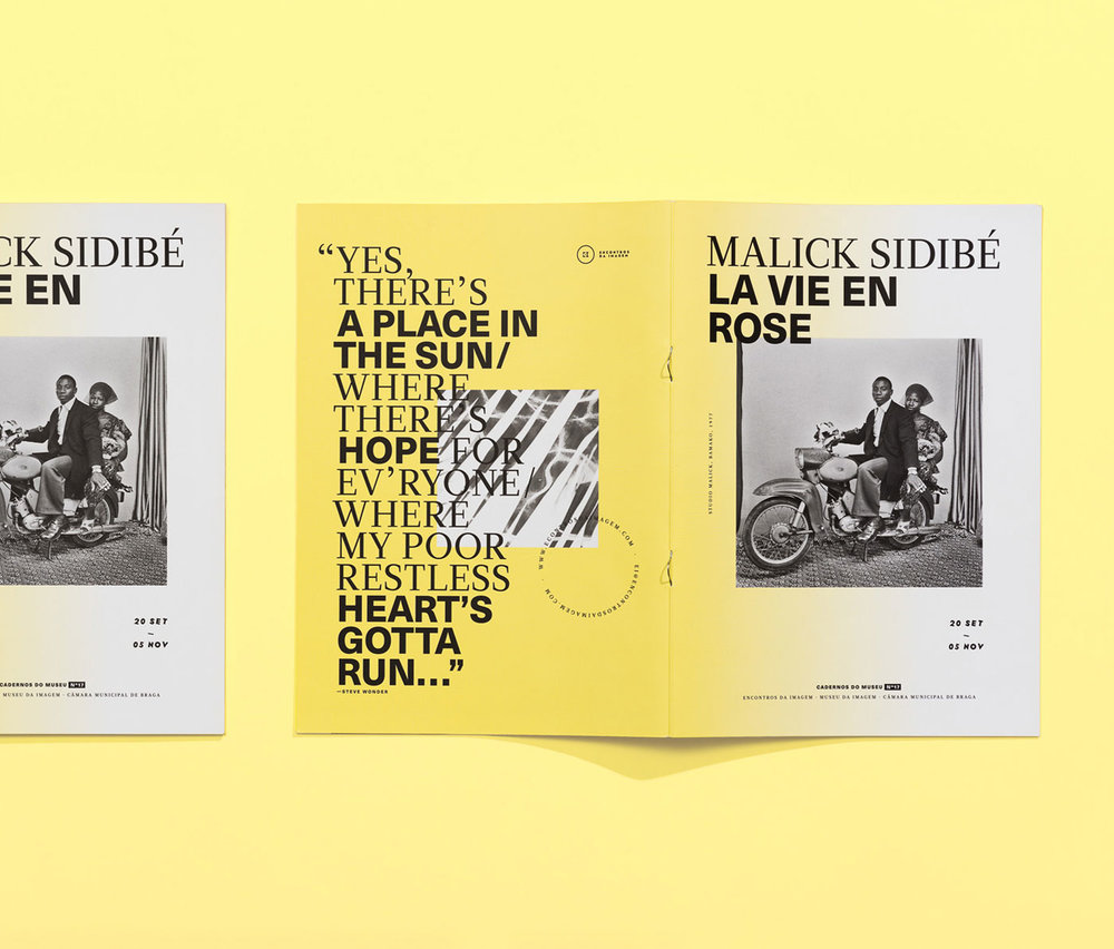
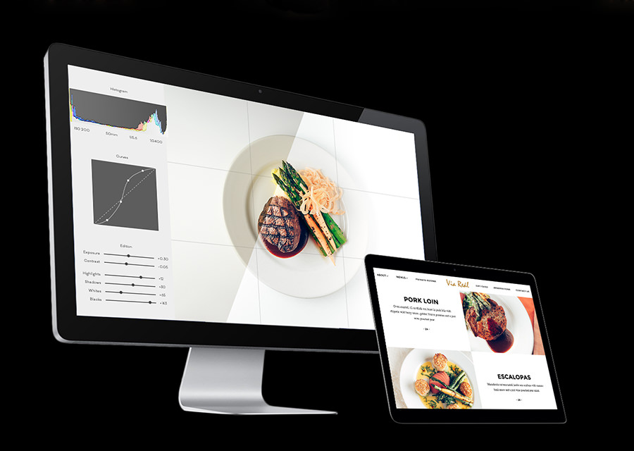
1.
Security
Together, all devices build a single local network for
enhanced security.
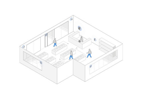
2.
Movement patterns
By tracing the movements and actions of customers, managers can better shape
the store layout.
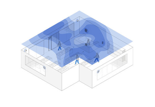
3.
Dwell time map
Tracking immobilized time by area allows for the measurement of customers’
attention and
interests.
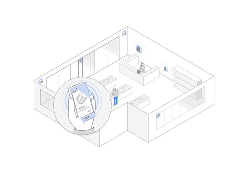
4.
Consumer-centered
Send customers targeted notifications and service offers based on their
location within the store
and proximity to products.
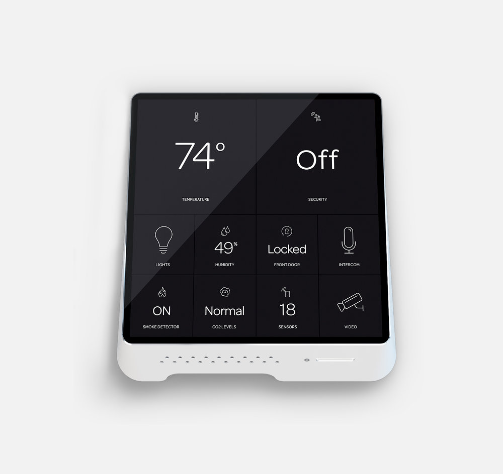
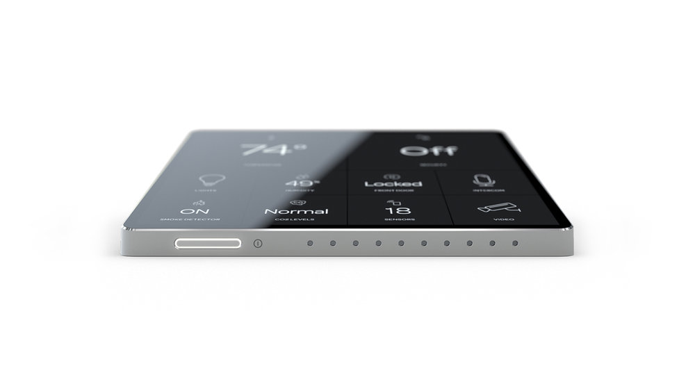
Router & Hub
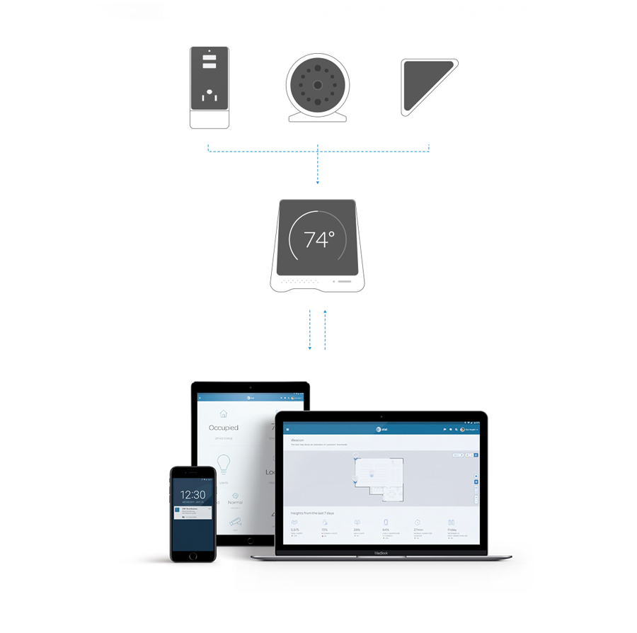
Smart Camera
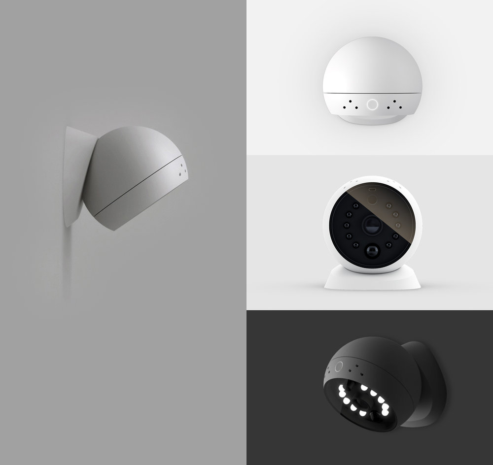
The camera has a built-in motion sensor that sends an
alert to users'
devices whenever it detects movement. The body is attached to a magnetic base,
which allows for easy
detachment and independent use as well as rotation in any angle or direction,
and built-in LED lights
for night mode.
Plug Outlet
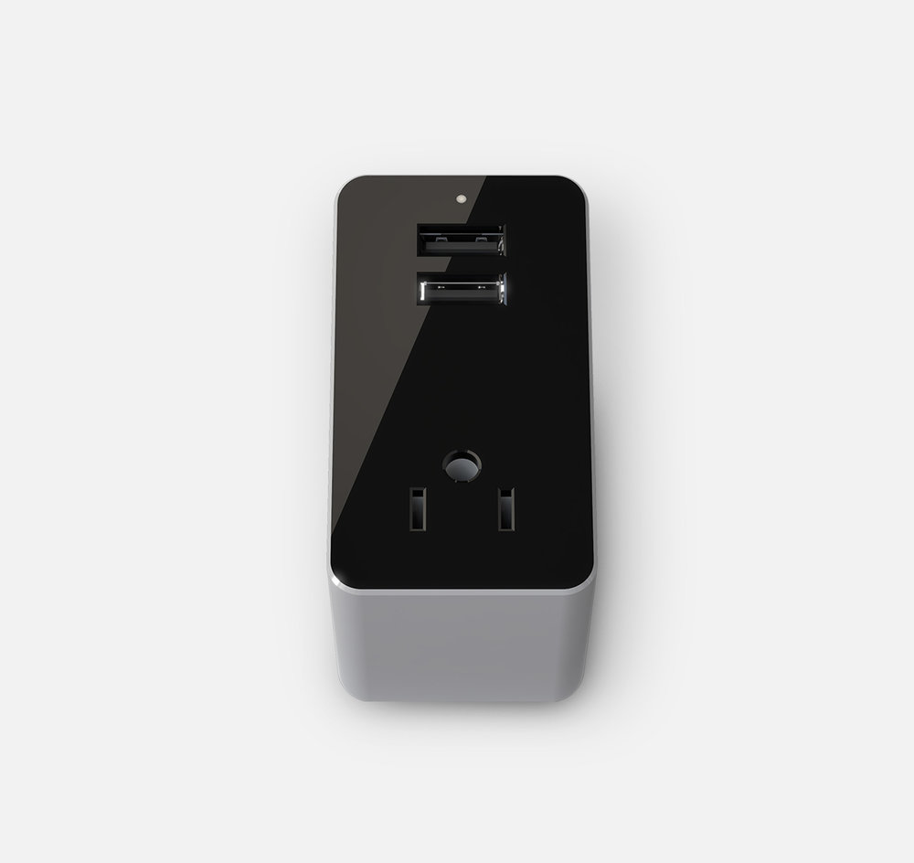
When the plug detects it has been disconnected from a
device, it alerts the
router, notifying the user as well. (A signal also appears on the mobile
device.)
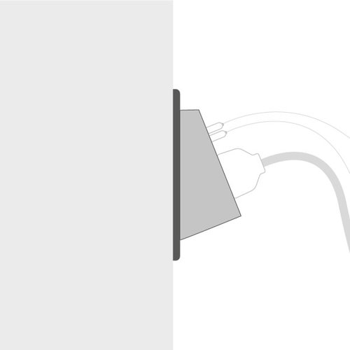
Contact Sensor

The contact sensor detects any vibration that is able to
activate an alarm
and thus inform the user of a possible intrusion. It was designed to easily fit
in any corner of
doors, windows and other places. It attaches by the use power strips, so it can
be placed on any
surface.
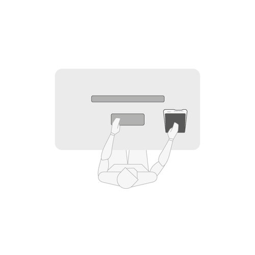
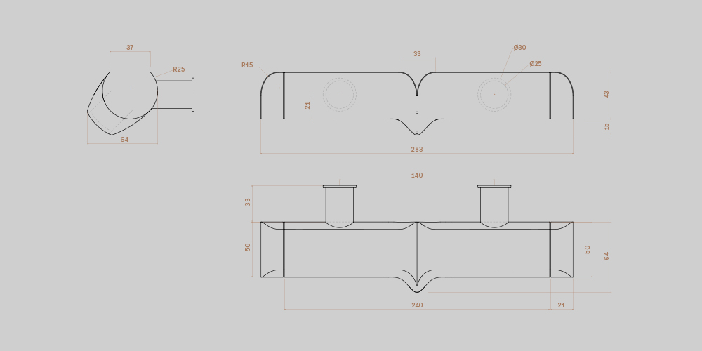
Ergonomics
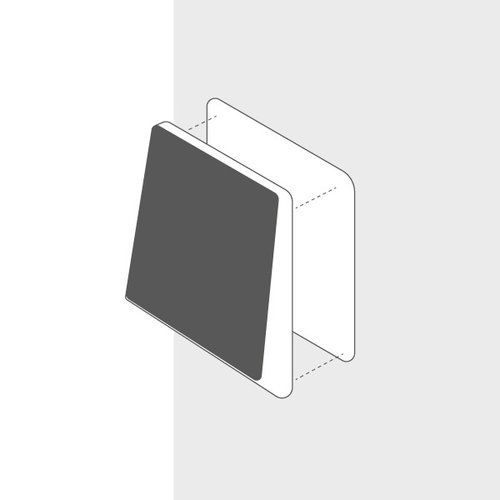
Tool free mounting
Users can install the router easily, without any special tools.
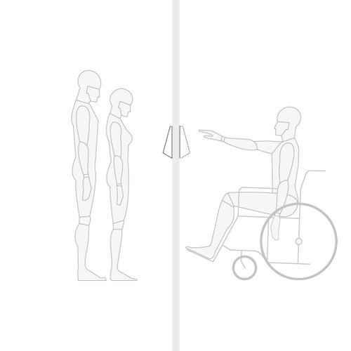
Visibility and accessibility
The screen angle benefits viewing in several perspectives for all users.
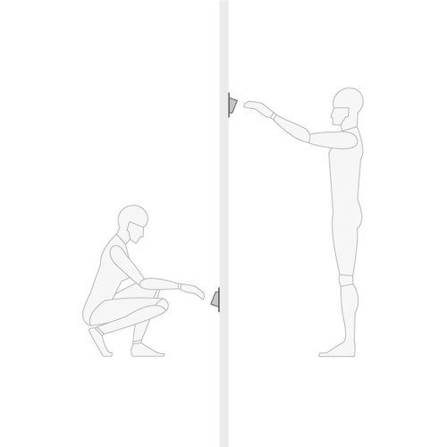
Flexibility
The hub/router can be mounted on a wall or placed on a desk. The adjustable
screen facilitates
interactions.
Angle and position
The outlet's front surface angle helps users more easily attach/detach plugs
from the power.
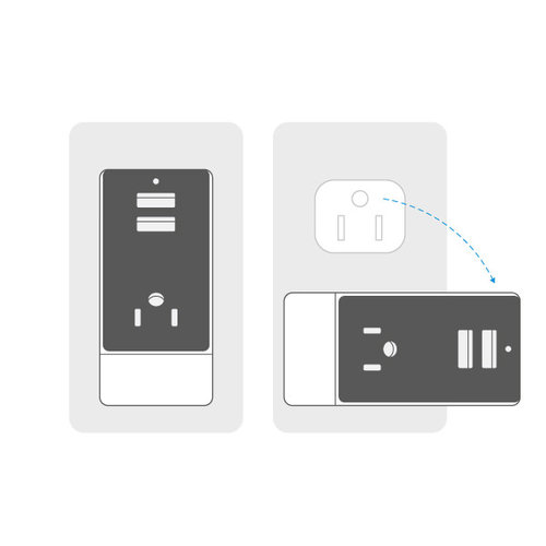
Rotation
A rotating base maximized access to all sockets.
Spacing
The arrangement and spacing of each slot was carefully considered in order
to bring a sense of
fluidity to plugging and unplugging.
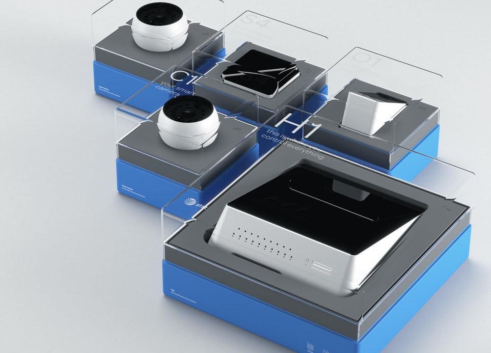
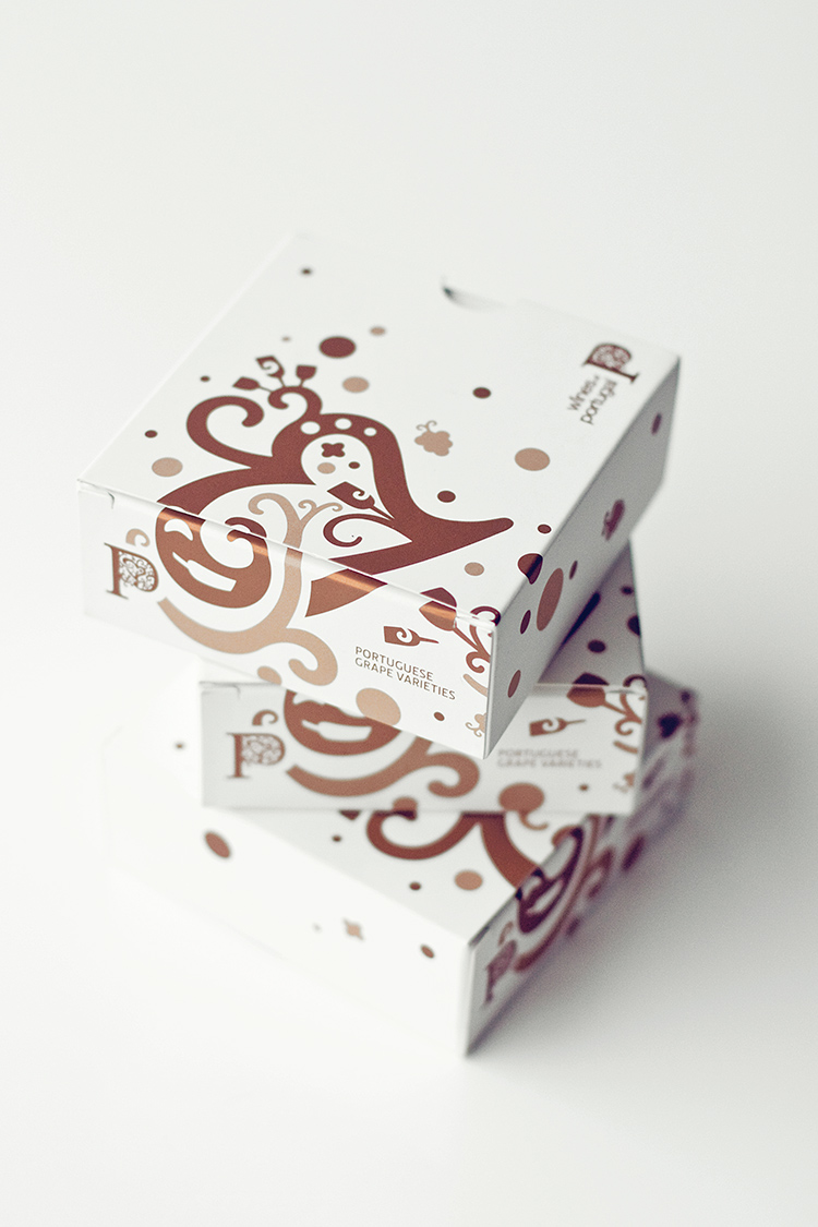
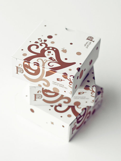
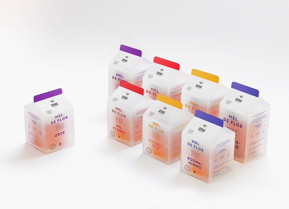
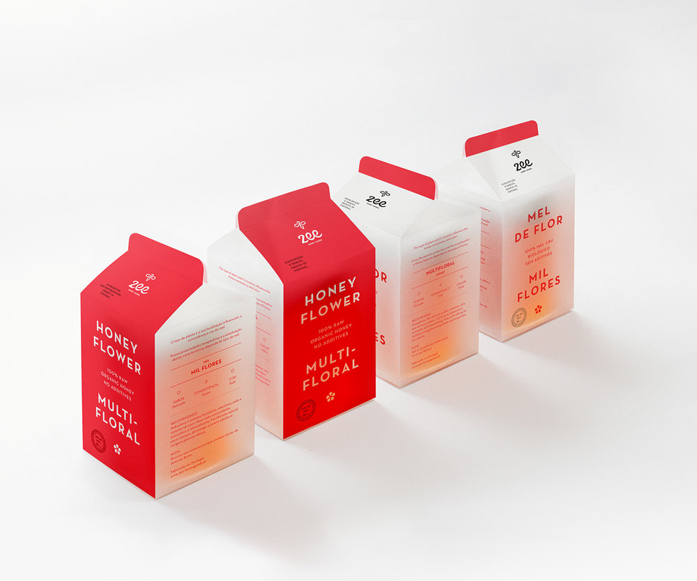
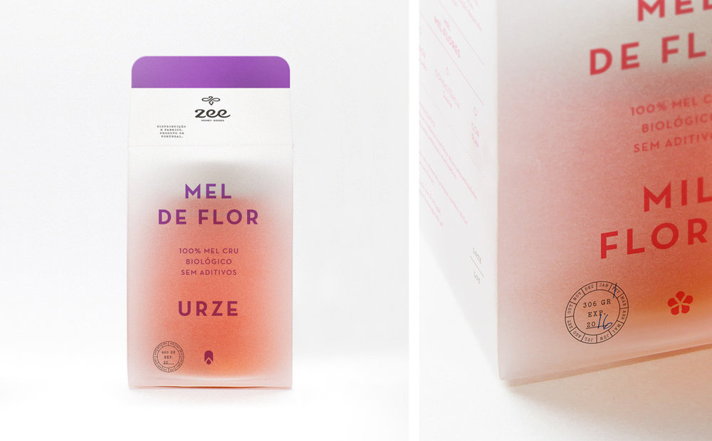
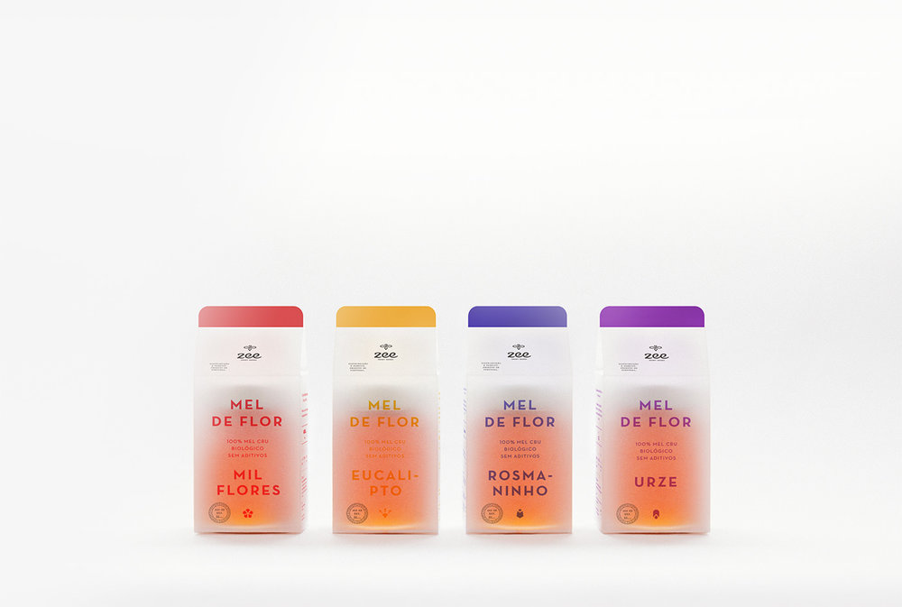
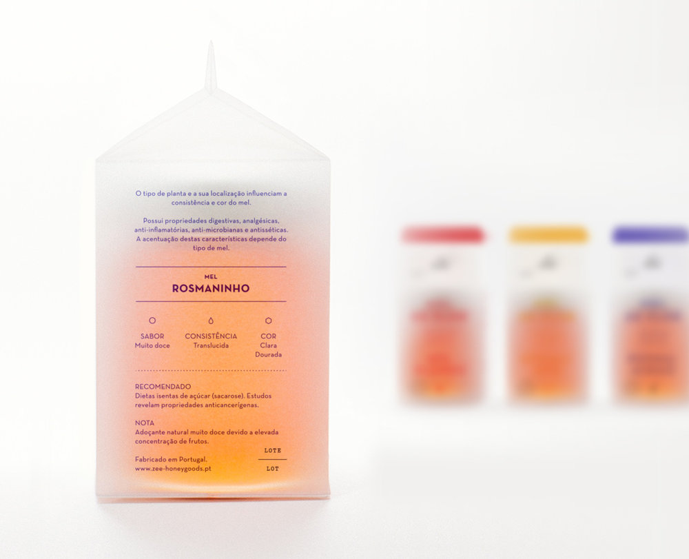
Packaging is flexible and modular, with a see-through
cover that reveals the
purpose of each device. Devices are displayed both individually and as a bundled
set, making it
intuitive and accessible for customers.


 >
>